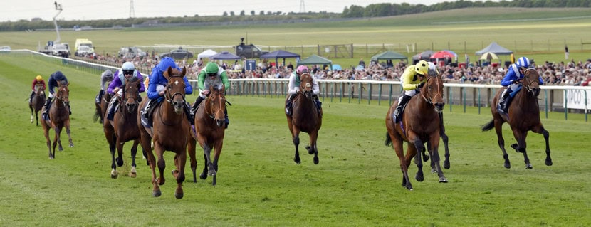
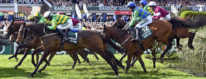
Not before time, in fact long after time is probably fairer to say, we're moving our services into the mobile world. The truth is that this has been something I've considered, and subsequently deferred, multiple times annually for the past five years.
The reason? It's really difficult to fit all of the racecard content you know and love into a smartphone screen (called a 'viewport').
My take has always been that it's better not to do something at all than to make a token effort at it, and so we've always shied from a mobile version of Geegeez Gold. Until now.
A further admission is that the reason we are working hard on a mobile version right now is that our hand has been forced somewhat. Google, who are a major source of new users discovering geegeez.co.uk, have since the start of 2021 introduced a 'mobile first' ranking policy. In plain English, if your site doesn't work well on a mobile device, you cannot expect to appear anywhere near the top of the search results. Bummer.
Anyway, that's the back story to how we've been working hard to bring the racecards and form tools fully into the mobile-iverse. And in the remainder of this article, I want to share where we've got to. As you'll see, we're not there yet; and as you'll also see we have had to make some concessions because of space constraints. It's my view that the more dedicated users will always prefer a desktop (or laptop) device to undertake their form study; but I also feel increasingly that we can offer a hefty subset of the most popular components on the smart device in your pocket. And tablet users may find their experience matches that of desktop/laptop.
IMPORTANT: THE DESKTOP VERSION YOU'RE USED TO WILL NOT CHANGE!
We're still working on the racecards and results tabs - they are the most complicated because they have the most features and functions - but the remainder of the racecards have been mobile-ized, as follows...
Cards Menu
The first page you land on when looking at a day's racing is the menu page. Desktop looks like this:
The new mobile version looks like this. The date buttons, plus search and tracker, have been neatly added at the top, with the dropdowns for all races and reports still available.
Below that, as you can see, part of the race titles cannot be seen, but these are visible by dragging across with your finger. The mobile version uses something called 'horizontal scroll' to enable users to easily view data at the right hand end of tables, and the first instance of that is on the cards menu.

Geegeez mobile racecard menu page
.
Full Form
Desktop Full Form looks like this and, of course, that is a LOT of content to fit into a mobile window, especially in portrait (i.e. how we normally hold our phones: taller and thinner, rather than the shorter wider phone-on-its-side 'landscape') view.
The mobile Full Form also uses horizontal scroll in the data areas (second image below). We've recreated everything from the desktop version, including the 'show/hide' ability for Filters, Race Record, Race Entries and Race Form. These are how the Filters display on mobile.

Full Form race filters have been faithfully replicated on mobile
And here is the data content area:

Full Form data uses horizontal scroll to incorporate all information on a mobile viewport
In the above image, I've scrolled across a little so both the start and end of the table data are out of sight. Having been playing for a few days, this is a surprisingly useful way of displaying more information than there is room for on screen. [Of course, more is visible in landscape mode, i.e. if you rotate your phone 90 degrees; and tablet presents a fantastic - probably better even than desktop - experience].
Profiler
Profiler is also a complete and faithful replication of the desktop version, again using horizontal scroll to display the elements at the right hand end of tables. In this tab, most users are interested in the left hand side of the cyan highlighted rows and so this will work 'as is' for them.

Profiler works pretty much *native* on mobile
Instant Expert
Instant Expert has presented a lot of challenges, for two reasons. Firstly, it is our most popular view and so absolutely has to be the best it can be. Secondly, there is a huge amount of intel crammed into the view. Alas, those two elements are not especially compatible, so we've designed different views for portrait and landscape.
Portrait View
Looking at your phone in portrait (tall, thin) mode will display a basic overview of Instant Expert:

Instant Expert in portrait is a basic overview of the relevant form credentials of the field
We've retained 'win/place', 'all/hcap' and the date range filters, as well as the horse/trainer/jockey/sire and race code dropdown options. But we were unable to include the ratings column or the range dropdowns (e.g. going from soft to heavy, etc) in this view.
You'll also notice that the columns have gone from three colour blocks to one - again due to space limitations. The numbers in the blocks are 'runs' (for instance, Al Ozzdi has had three runs on today's going, the 'Go' column) and column sortation is done on the basis of percentages. While that is confusing on the face of it, it enables the retention of two key pieces of information: first, sorting by the horse with the best performance in percentage terms; and second, understanding how many runs that percentage was achieved against (i.e. not discounting a horse who has failed only once against a given criterion and, equally, not marking up a horse too much for going well just once against a given criterion).
Hopefully that all makes sense: the summary is that we've distilled all we can in terms of the available space. And I'm pretty happy with what we've achieved here.
Landscape View
In landscape - with your phone viewed on its side - you will see a much more familiar Instant Expert. Indeed, you'll see everything as you'd expect, including the inline form when tapping on a colour block.

Landscape Instant Expert is very close to the existing desktop version
All sortation of columns etc works as you know and love, and I'm delighted we've been able to exactly replicate the existing Instant Expert on mobile devices. It was a lot more fiddly than might first appear!
Pace
The pace tab is another that fits perfectly on your phone when viewed in landscape (side on), and we again use horizontal scroll to allow you to see everything in the more natural portrait mode. Here's portrait:

Pace tab is replicated faithfully and uses horizontal scroll for its portrait mode
Again, I've found this to be highly user-friendly even in portrait mode, and a big step up on the current messing around with pinch and zoom involved when out and about.
Draw
Draw is a clean experience even in portrait, the two slight changes being horizontal scroll to access the right hand columns in the tables; and the charts being a little more 'square' than is the case on desktop.

Top section of mobile draw tap in portrait mode
I've scrolled across to the right of the table in the above screenshot. As you can see, there are a lot of data in there, so we've added faint grey divider lines to break it up a touch. Still, it is a dense forest of numbers, I grant you.
Below is the heat map in mobile portrait view.

Draw Pace Heat Map in portrait mode
Odds
The odds view is a simple one and, though we've moved the form and 'best' columns, I don't think we've lost any of the value of this quick digest of the market.

Mobile odds tab view
Next Steps
So that's where we're at with the development. Right now, we're working on the card and results tabs, which will not include all current features I'm afraid - at least not in portrait mode - simply because of space constraints. Indeed, they will likely look more different than any of the other tabs (except portrait Instant Expert). After that, I'll need to go over everything to ensure it all 'hangs together' as it should. We will be working through the report suite and form tools as well in due course, but the main focus at this time has been on the racecards.
It's always a kiss of death to put release date timescales on these things, so what follows is assuming no major dramas manifest in the coming days: I hope we'll have the mobile cards live before the end of the month. *crosses fingers - and, indeed, legs*
This has been a thorny technical challenge because we didn't build 'from the ground up' but, rather, repurposed our existing content into a mobile format. But we're building it intuitively and to add as much value as possible while you're away from your desk. I promise, bathroom break form study will have never felt so good!
Matt
p.s. we are also working on sectional 'fast finishers' features which ought to be on stream in March. So much to follow in 2021: we're always re-investing in your Geegeez 🏆


Keep it simple
keep tabs user friendly
not convoluted
keep it free to use
Process is starting to look very good Matt. Myself, like probably many of geegeez users will find these changes very handy, especially when away from home, and you don’t have access to a desktop. However in saying that, it’s not like it’s a huge faff now, it’s what you get used to. Looking forward to seeing it up and running..
I get why you have to do it, (growth of the business is vital) and I like the appearance of what you have achieved but I’m a dinosaur with the view of “if it ain’t broke, don’t fix it!”. I’ve learned to manage things on my phone for the last few years and have no complaints with the “fiddliness” of managing on a small screen and as I’m retired (a privilege we don’t all have, I know) most of my studying and decision making is done on a laptop at home. For those on the move I’m sure it will be a boon but for an “old dog” new tricks are harder to learn – the most important thing is the Geegeez isn’t standing still, it’s moving with the times and that has to be applauded. Well done, Matt; looking forward to the “fast finishers” feature more!
I’ll be very surprised if you don’t find everything extremely intuitive and easier to use, Richard. But, that said, of course change brings challenge. We’re ready for that!
Best,
Matt
Hi matt
I dont know why you need to change it since I joined I have only ever used my mobile to acces everything it’s so easy to use the way it is
Kind,Regards
Andy
I
Hi Rich,
There is an option on Chrome mobile browser for ‘Desktop site’. If you set that, it’ll be as it was.
I’d recommend trying the new version first, though, as you might prefer it. (No problem if you don’t!)
Best,
Matt
Impressed so far
Very good can see now properly and very informative
Will be very useful for when one is ‘down the pub’, whenever that might be . . .
Maybe the wrong place to post this, love your whole set-up, only thing it is missing for me is BSP & IR lows and hiighs as a line item against each race in the form and the results page generally.
Thanks Jason. We’ll definitely be getting to BSP data later in the year
Matt
This can be very tedious journey, the final product upon mobile shall be user friendly for all.
It’s a marathon not a sprint.
Best wishes
Simon
Are google helping foot the bill for all your efforts Matt?
Didn’t think so. Big fish controlling little fish again.
All the best Matt.
Looks good Matt
Looks great Matt! I tend to use my phone much more than my PC, so am looking forward to this new release. Regards.
On a lighter note, love the headline picture, very tongue in cheek! :-b
Looking good Matt, just a couple of queries if I may… On the racecards home page will we be able to access the “filters” for class / number of runners / h’cap v non h’cap, etc? And in the video on You Tube you refer to the ratings (SR, TS, RPR) being axed from the mobile version. As a keen ratings user, I was wondering, will they show if the screen is rotated to landscape, a bit like the way Instant Expert switches to a more conventional view if landscaped? Many Thanks.
Hi Richard
There will be no card filters on the mobile view.
If you select ‘view desktop mode’ in your browser’s settings, you’ll be able to access the filters.
Ratings WILL be visible in landscape.
It’s just not possible to retain everything from the desktop view in mobile due to the much (and I mean, MUCH) smaller viewable area.
If you’ve ever tried using one of the alternative mobile racecards, you’ll know what I mean. Frankly, to call them skeletal is an insult to skeletons!
Matt
Comments are closed.